Dec 1
Modern UI for SumatraPDF
The current UI seems very outdated. I would love to see an updated UI that embraces more of the Windows 11 design style.
Closed
a combination of logic like in Chrome and a convenient file manager. And why is it still not possible to work in catalog mode-that is, add each opened document to the Sumatra folder in documents
A lot of readers, when they show 2 pages on the screen, display page 1 on the left and 2 on the right, and when scrolling with the mouse wheel at once, change them to 3 and 4, and it's not always convenient. make the mode when there was 1 on the left, 2 on the right, and when scrolling it became 2 on the left. 3 on the right. This is very convenient when reading technical literature, where sometimes you need to return to the formula in the text, etc.
by the way, I recommend you to take a closer look at the simplicity and conciseness of the program from developer CintaNotes (cintanotes.com ) it's probably an ingeniously simple and user-friendly interface and excellent performance-a program for taking notes. And keyboard control with keyboard shortcuts. something is missing from Sumatra PDF
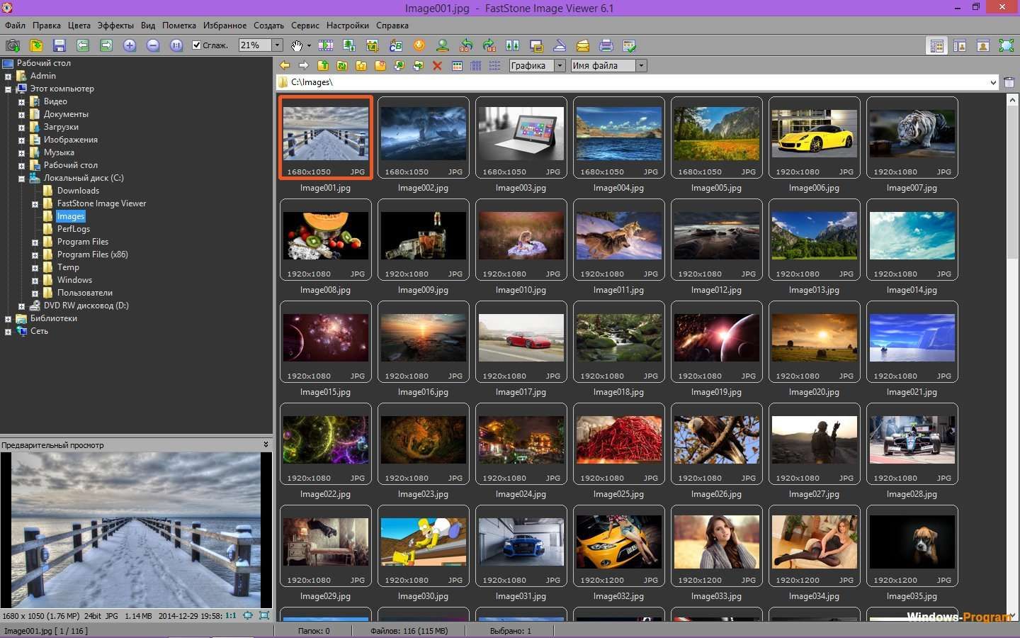
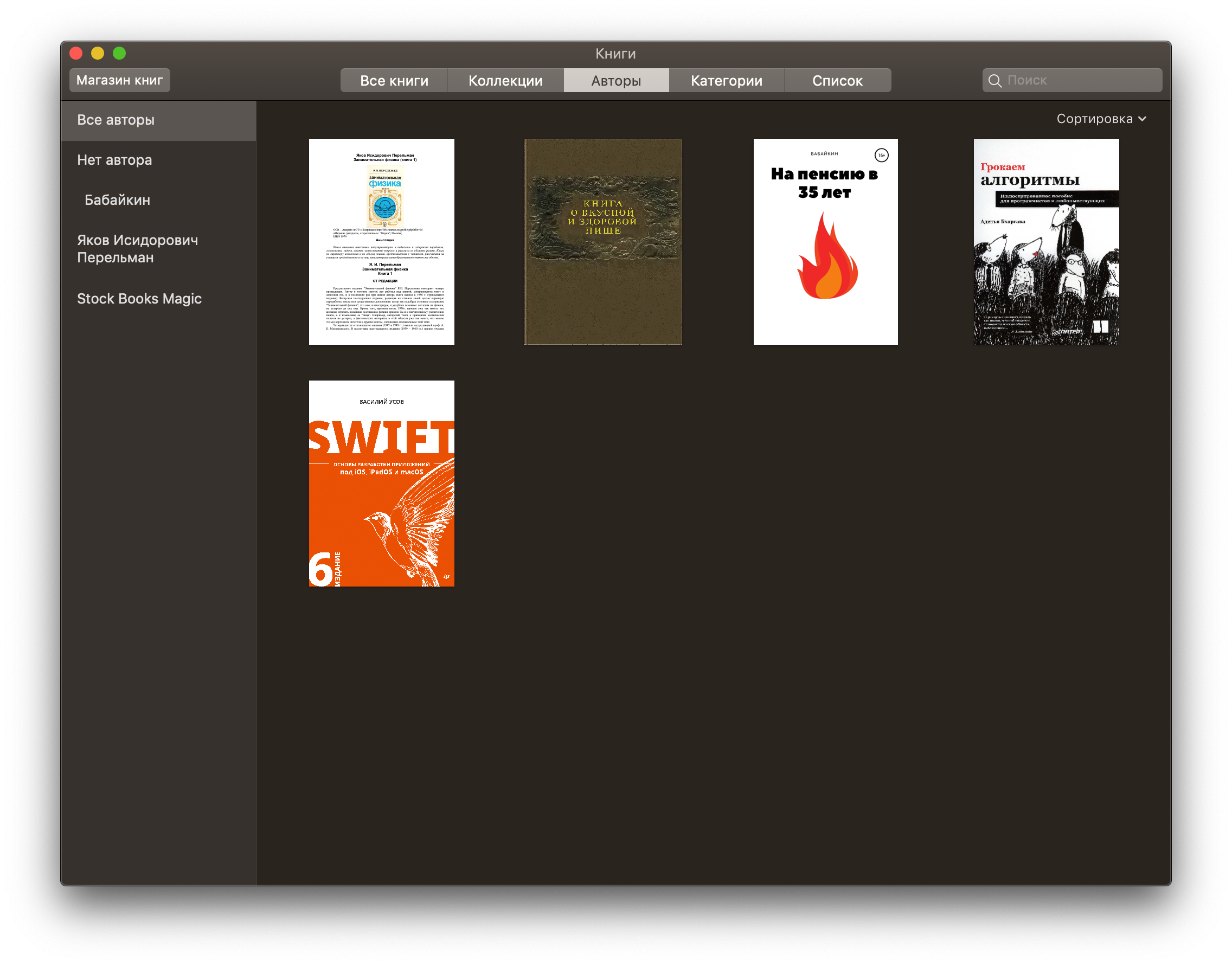
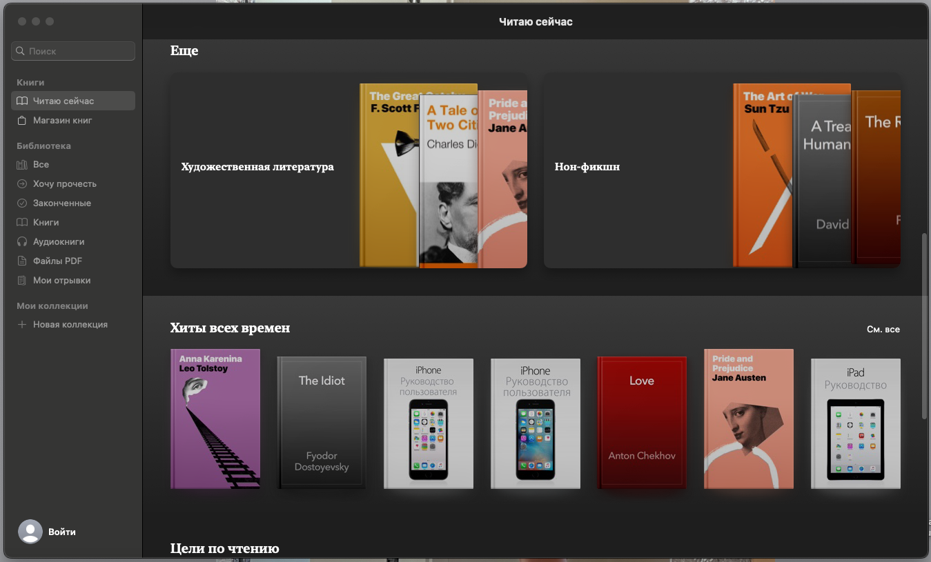
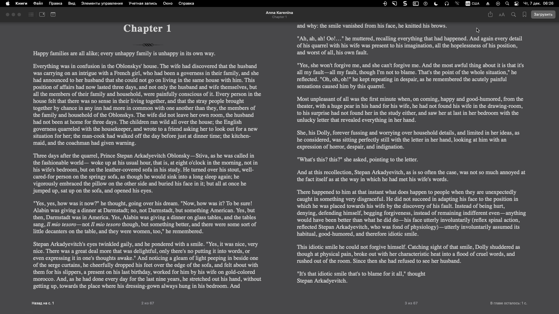
I think we should hire a professional. There are very competent solutions in the design of Books on Mac OS: simple and logically positioned control buttons, text zoom reduction, night mode that do not interfere, full-screen mode where you can remove all controls and not be distracted. I really like FastStone Image Viewer, what kind of logic and zoom is there for long pressing and fast scrolling of various documents. In general, fast scrolling, the ability to select, export a text fragment or quote quickly and conveniently, add bookmarks-this is the most convenient thing that should be in the reader. And I also like the tab logic as in Chrome. If it's all put together and take the best ideas. There is a problem right now. that the program does not track the absence of a document and displays non-existent files on the start screen. Ideally, when adding books to the program, for example, it should offer to leave them in the catalog or move them to the library-for example, Documents/sumatraPDFbooks. Also, for reading magazines, there is not enough display of page thumbnails for quick navigation, as in RepliGo Reader, as there are in many readers on Andoid. Then a lot of readers when they show 2 pages on the screen display page 1 on the left, for example. on the right, 2 and when scrolling with the mouse wheel, 3 and 4 at once are not always convenient. make the mode when it was on the left 1, on the right 2, and when flipping it became on the left 2. on the right 3. This is very convenient when reading technical literature, where sometimes you need to return to the formula, etc.
I don't mind the interface apart from the highlighter editor menu which is extremely impractical
gamberoillecito: ditto
The UI was updated to modern DPI & SVG after 3.2 but it causes more problems than the older one which you could customise by skinning. The UI is very much MS components so down to how MS Visual Studio builds text and borders.
too much stuff in one request. a request should be concrete and of manageable size